House Music Event Series – Season 23/24
Co-founded with two friends as a division of the Music is for Lovers event series in Hamburg, this project reimagined the spirit of iconic 1970s gatherings like Blow Up, Studio 54, and shows like Soul Train. Our vision was to create a house music experience that is both flamboyant and heartfelt — a celebration of warmth, love, and unapologetic self-expression.
INSPIRATION
During a trip to Copenhagen in 2023, I visited the bar Rust, where the 70s-inspired interior and décor — particularly the star symbolism — sparked the initial concept for the signature look.
SymboliSM, LOGo, FIGURATIVE MARK – Crafting the Identity
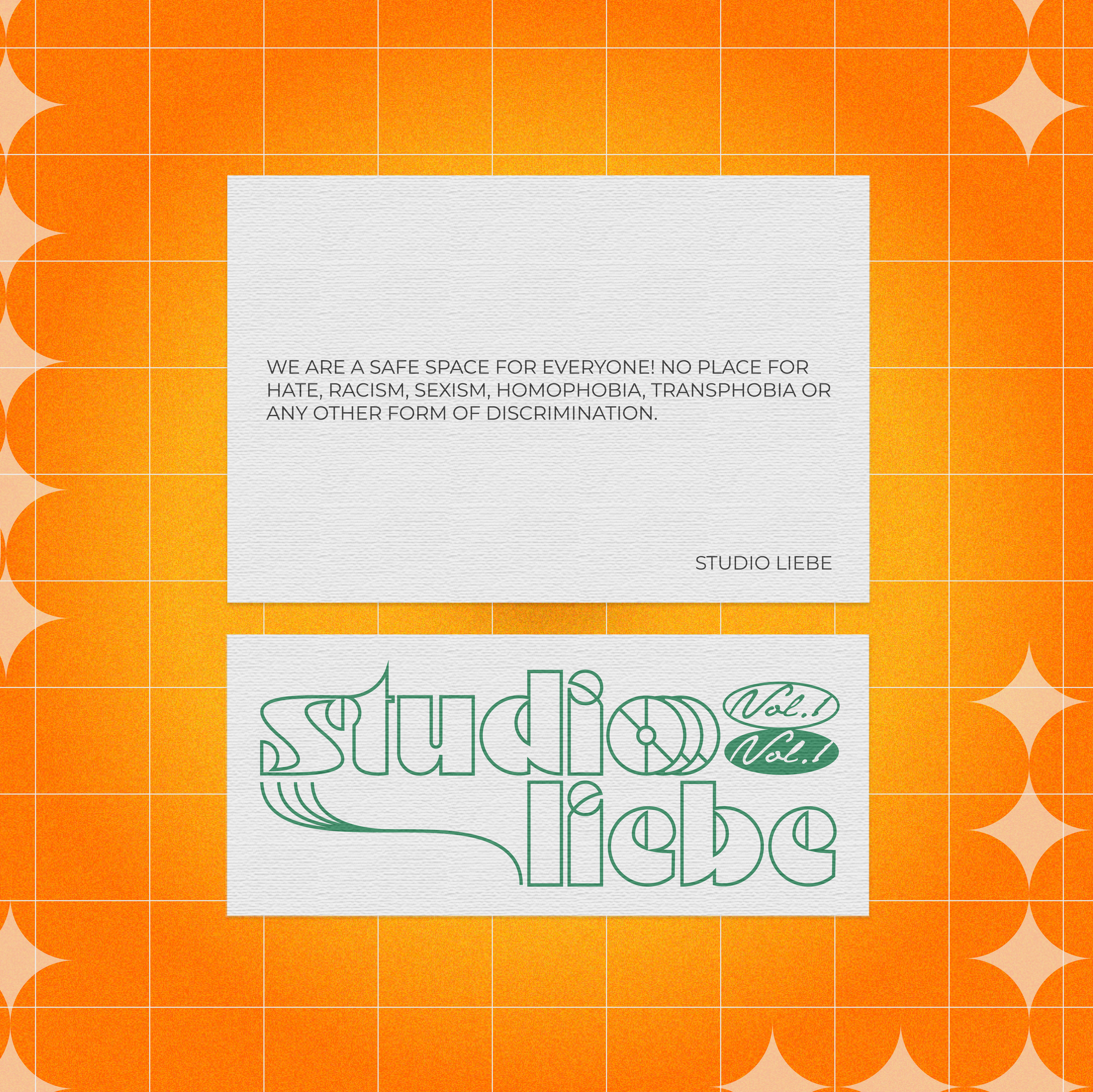
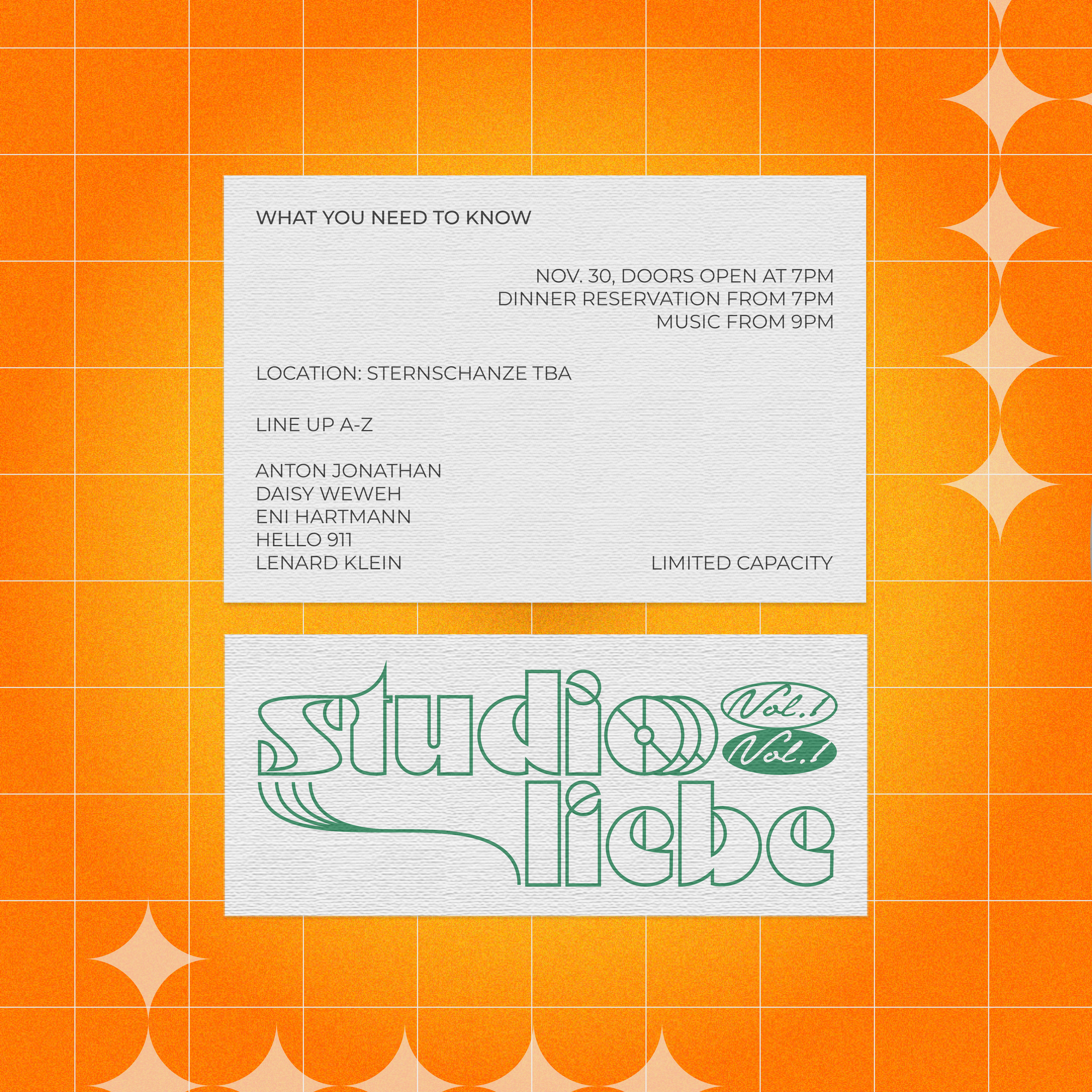
The circle serves as the foundational shape in the visual identity of Studio Liebe, embodying both a design and conceptual philosophy. Inspired by the bold aesthetics of the 1970s—think disco balls, vinyl records, and cosmic starbursts—the circle became a versatile motif, seamlessly connecting the retro spirit to a modern-day celebration of unity and flow. With regard to the 70s design of Rust, the circle shape helped me to recreate the star symbol.


The shape represents inclusivity, wholeness, and continuity—values at the heart of Studio Liebe's mission. Its unbroken form mirrors the immersive, cyclical nature of house music, where every track flows effortlessly into the next, and the venue becomes a shared space of endless experiences.
In these designs, the circle appears as a key element, from the rounded typography (and hidden circle shapes) in the logo to the layout of visual assets, such as Instagram posts. It subtly reinforces a sense of harmony and movement, inviting the audience to lose themselves in the rhythm and energy of the experience. Whether consciously or subconsciously, the circle draws people together, much like the music and the warm environment we aimed to create.


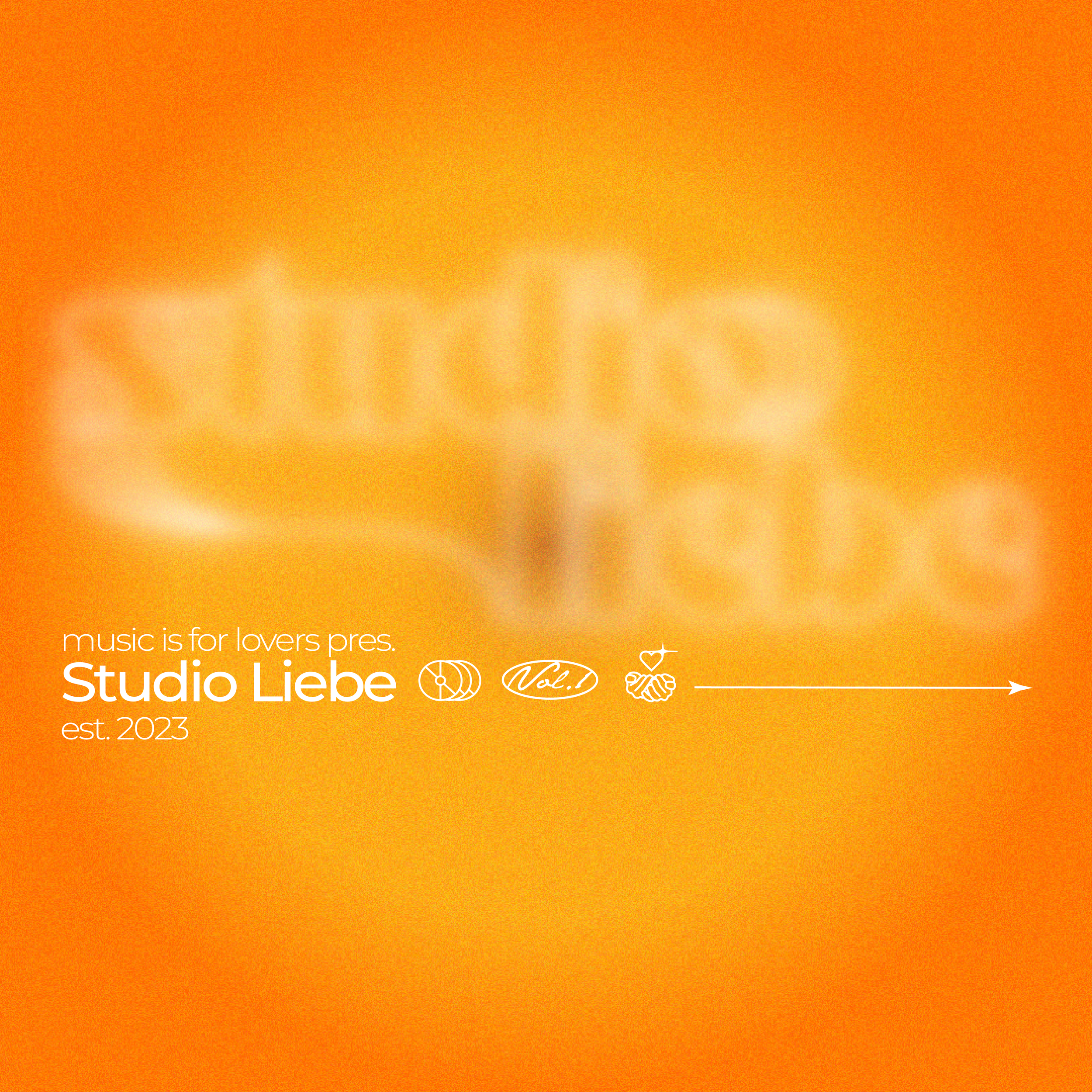
For the logo of Studio Liebe, I drew inspiration from the typeface Motter Ombra, designed by Othmar Motter in 1972. As a bold, playful font rooted in the aesthetics of the 1970s, Motter Ombra perfectly encapsulates the spirit of our project, which bridges retro influences with contemporary sensibilities. Known for its geometric letterforms and lively personality, the font evokes the charm of vintage design while maintaining versatility in modern applications.
To align the logo with Studio Liebe's warm, easygoing identity, I adapted Motter Ombra in several ways. Rather than using a filled, heavy look, I opted for outlined letters to introduce a sense of lightness and visual flow. This choice not only reflects the soft and inviting character of the brand but also opens the door for the logo to double as a neon sign—a fitting nod to the nightlife culture our events embrace.
Further refining the typeface, I adjusted and "cleaned up" the original shapes to enhance the visual flow and coherence of the logo. The most significant alteration was to the letter "o," which I redesigned as a figurative mark for the brand. By incorporating a CD-inspired shape (which can also be interpreted as a vinyl record), the "o" symbolizes a bridge between the analog past and the digital present, connecting the eras of music that define our vision.
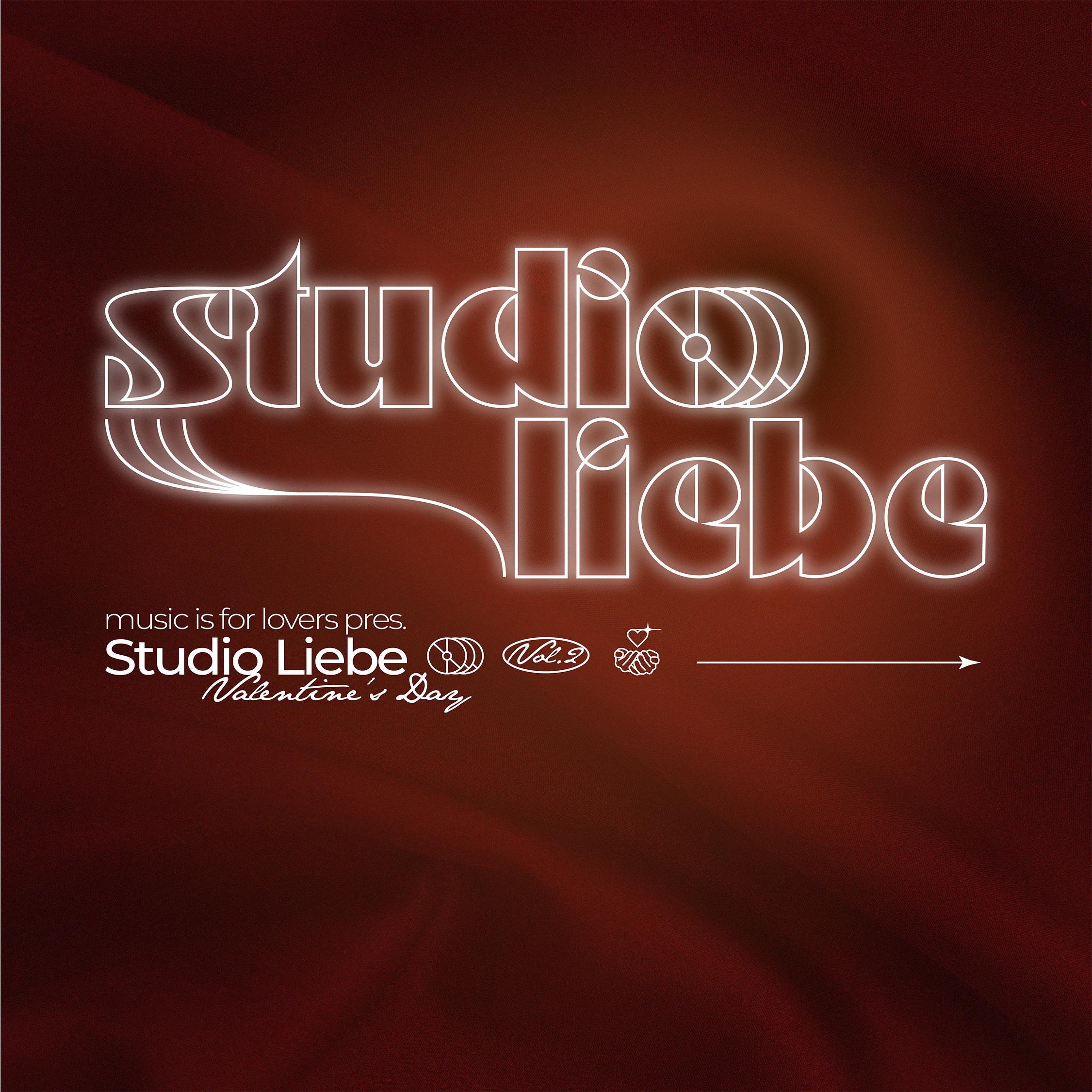
To add stability and evoke the aesthetics of 70s music show intros, I introduced curved, bending lines to the left of the logo. These lines create a sense of motion and rhythm, further tying the visual identity to the experience of music and dance.
Finally, I gave the logo's outlines a glowing luminescence, reminiscent of neon signs. This subtle glow reinforces the connection to nightlife venues and brings an energetic, atmospheric touch to the design. Additionally, I integrated hidden circular shapes throughout the logo, marked in red in the development phase, as a unifying element to emphasize harmony and balance within the visual identity.
The result is a logo that captures the nostalgic essence of the 70s, and embodies the spirit of Studio Liebe.
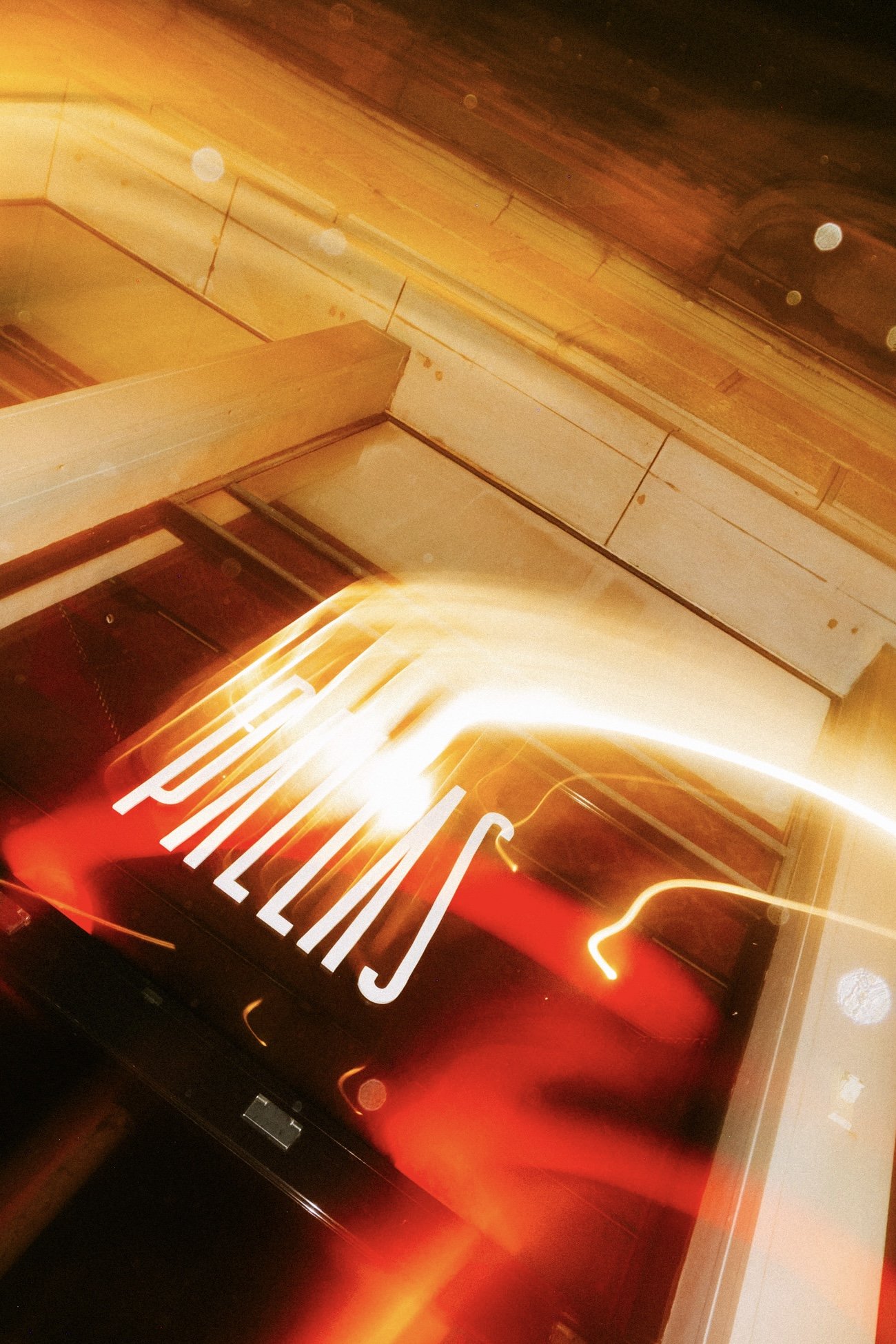
Bringing the Logo to Life – From Smoke Glass to Neon
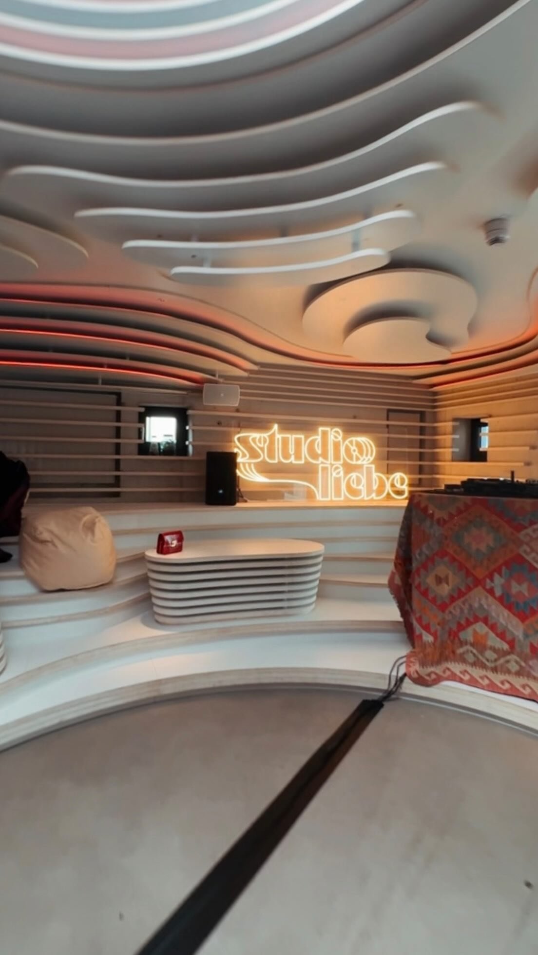
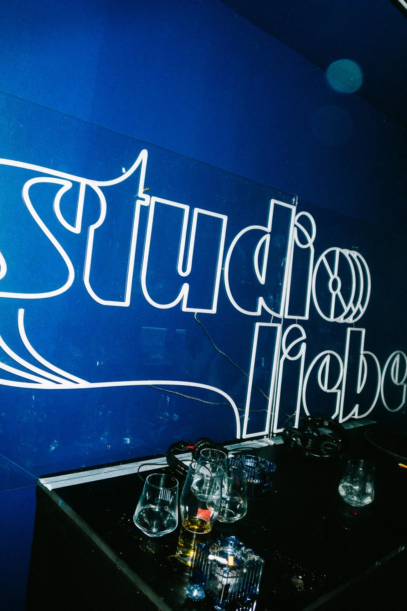
To enhance the visual identity of Studio Liebe at our events, we decided to create a neon sign of the logo. Neon’s glowing, retro aesthetic perfectly complements the brand’s connection to the 70s and its vibrant, modern reinterpretation.
However, due to a delay in the delivery of the neon sign, I had to explore an alternative solution for prominently showcasing the logo at our first event. Drawing on the flexibility of the design, I opted for a high-quality medium: we plotted the logo in white onto a dark brown circle-shaped smoke glass tabletop.
This unexpected adaptation offered a sleek and elegant look, which I further enhanced by using an orange spotlight to illuminate the piece. The combination of materials and lighting created a striking focal point within the venue.
By the time of our second event, the neon sign was ready. The glowing sign added a new dimension to the venue, encapsulating the playful yet polished aesthetic of Studio Liebe. Together, these approaches highlight the adaptability of the logo and its ability to bring our visual identity to life, no matter the circumstances.

EVENTS, SOCIALS, VENUES


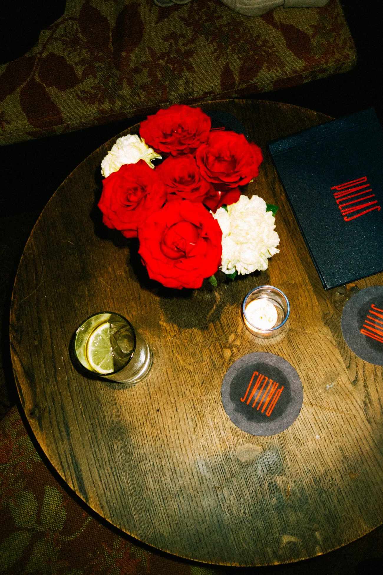
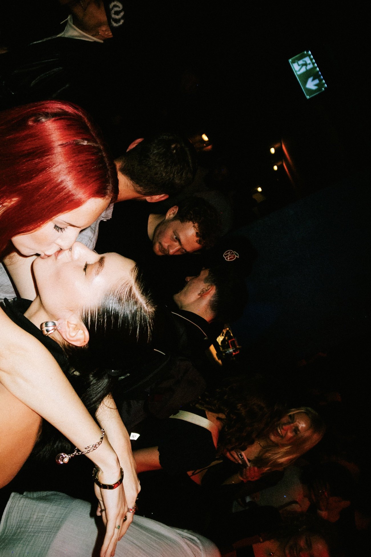
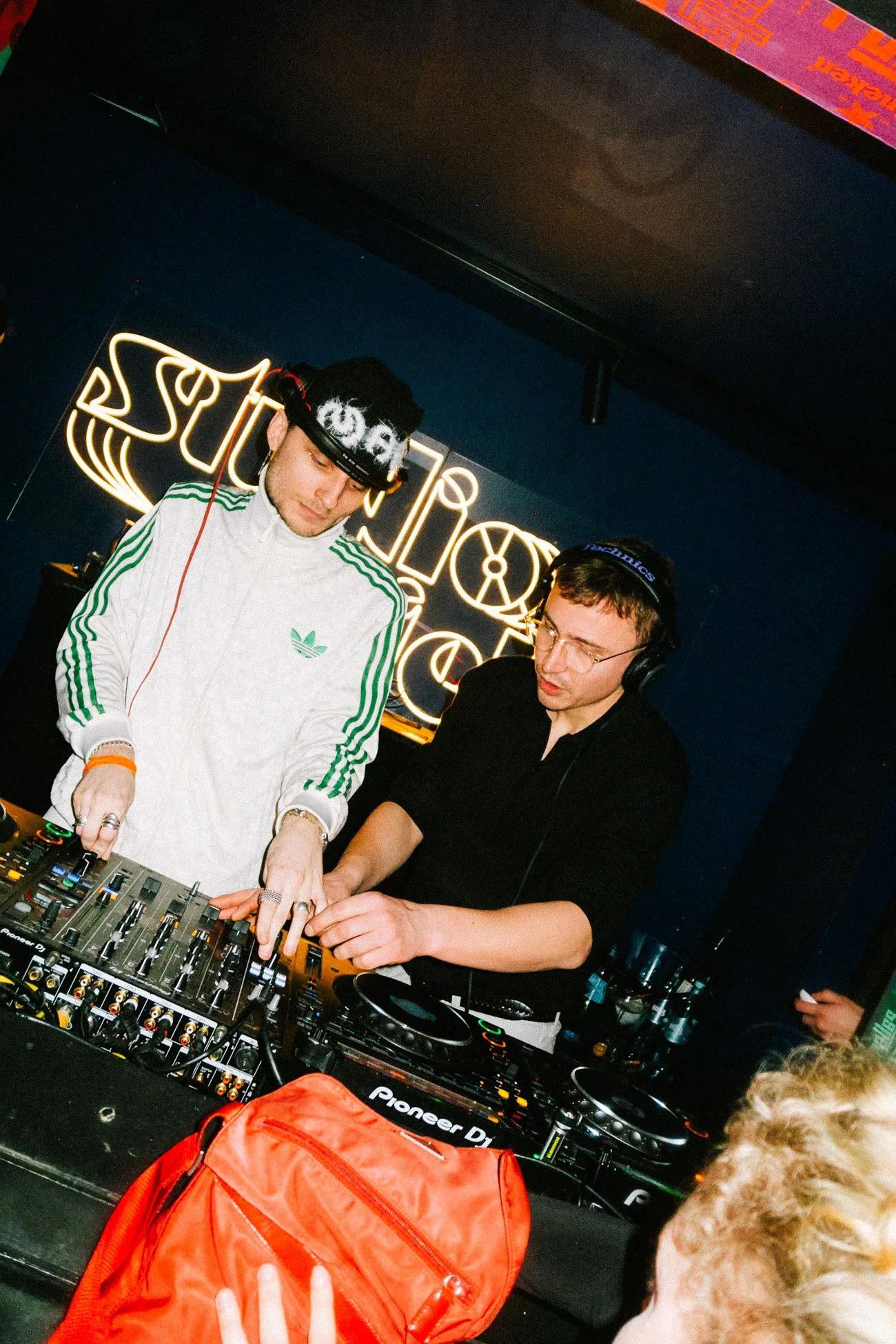
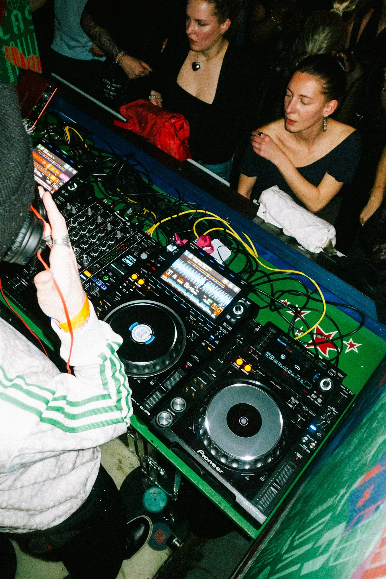
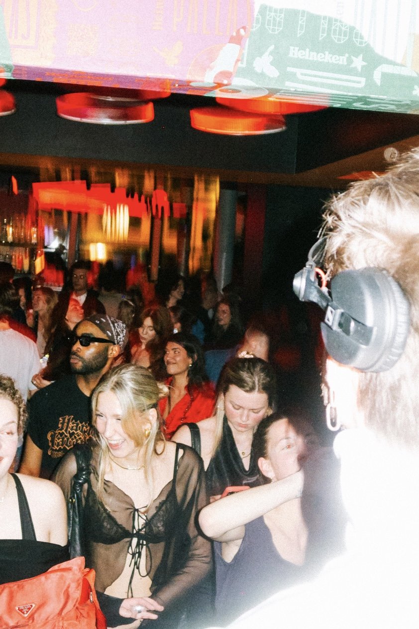
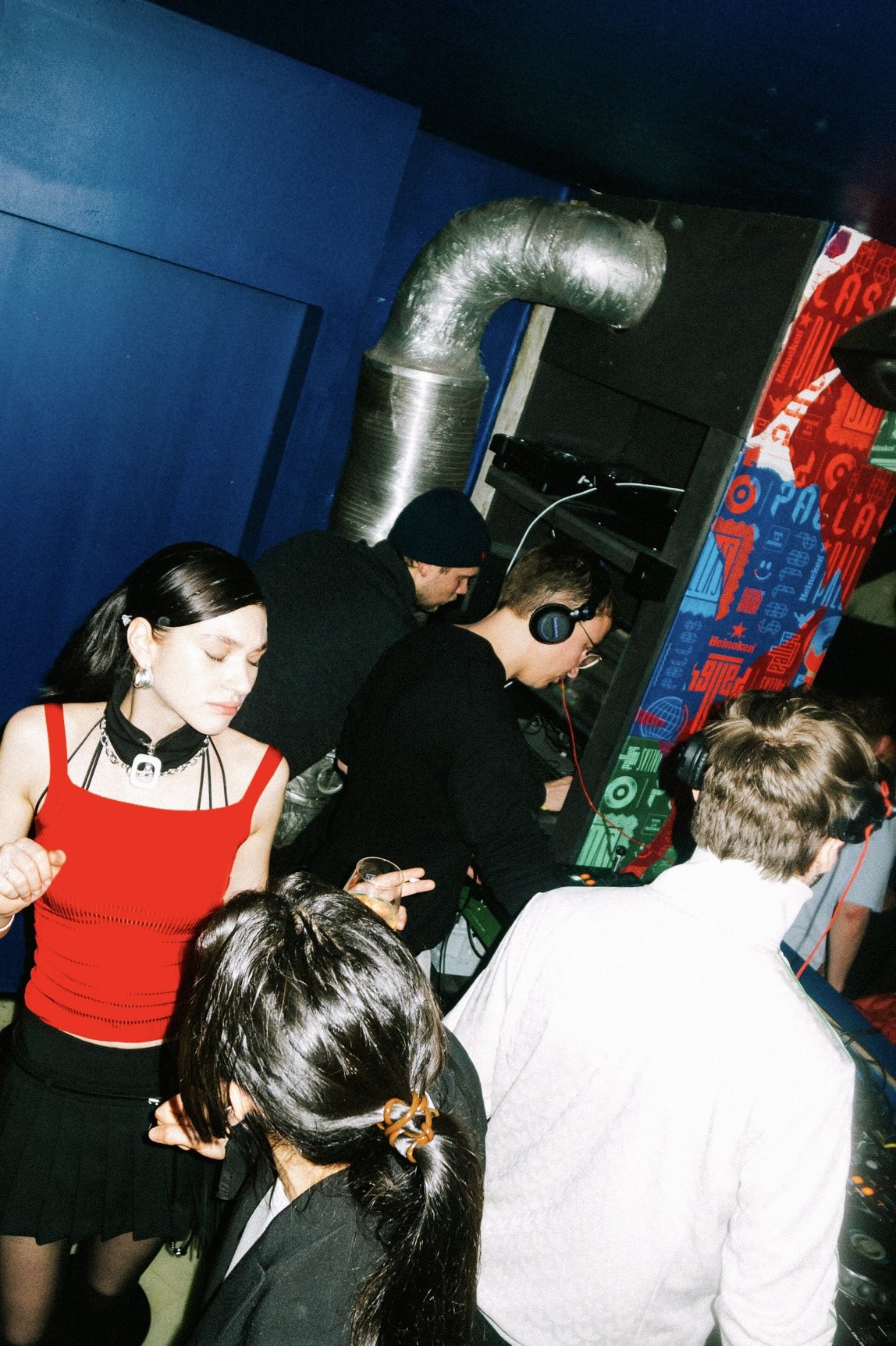
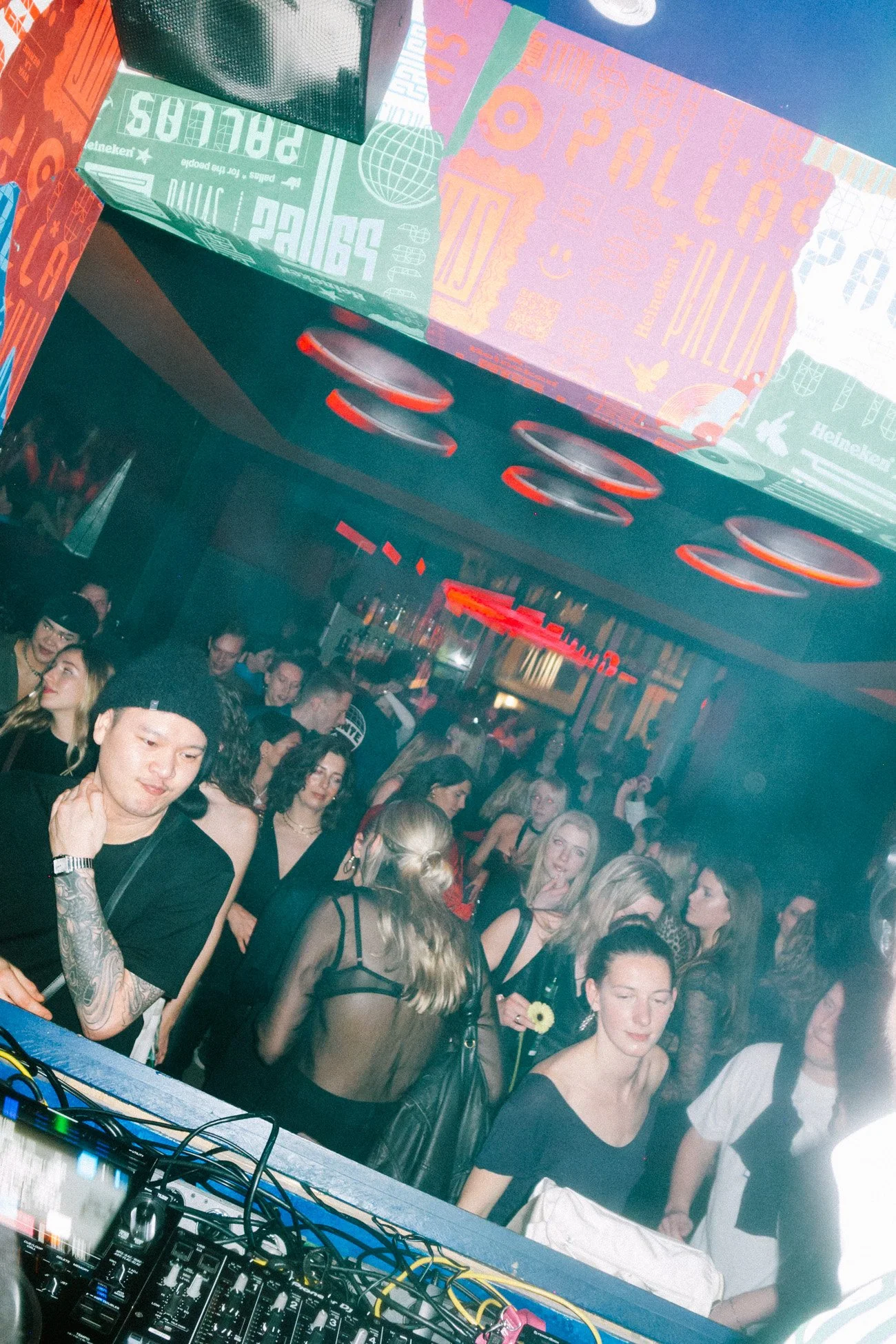
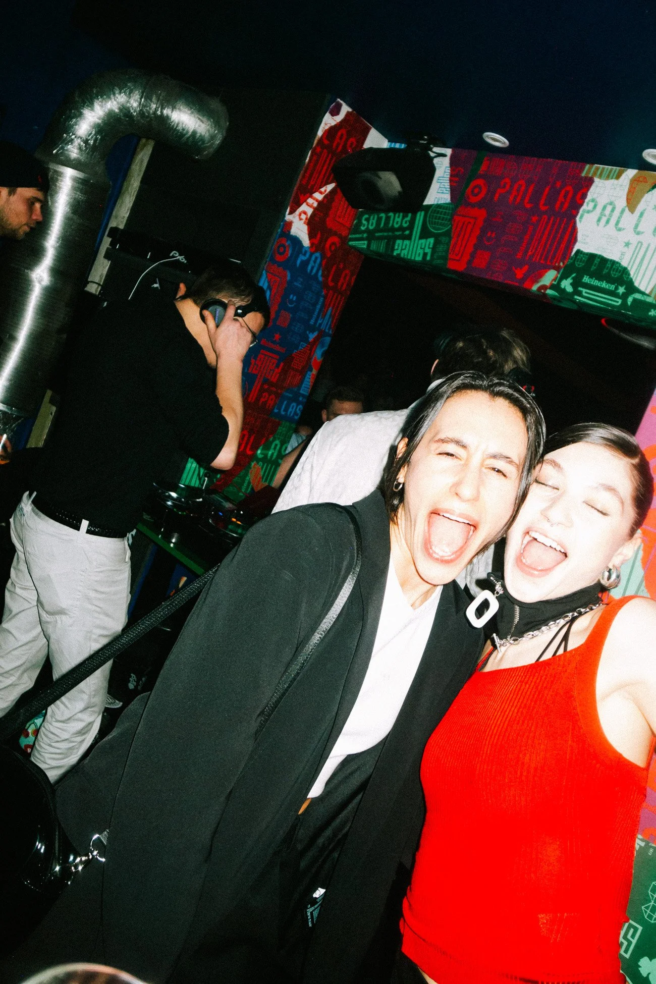
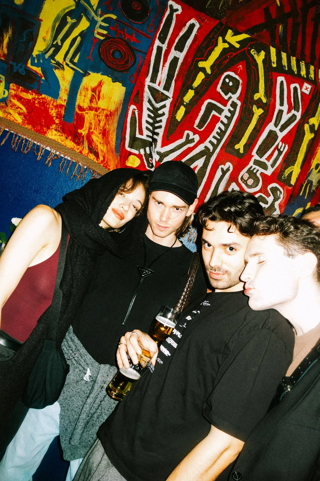
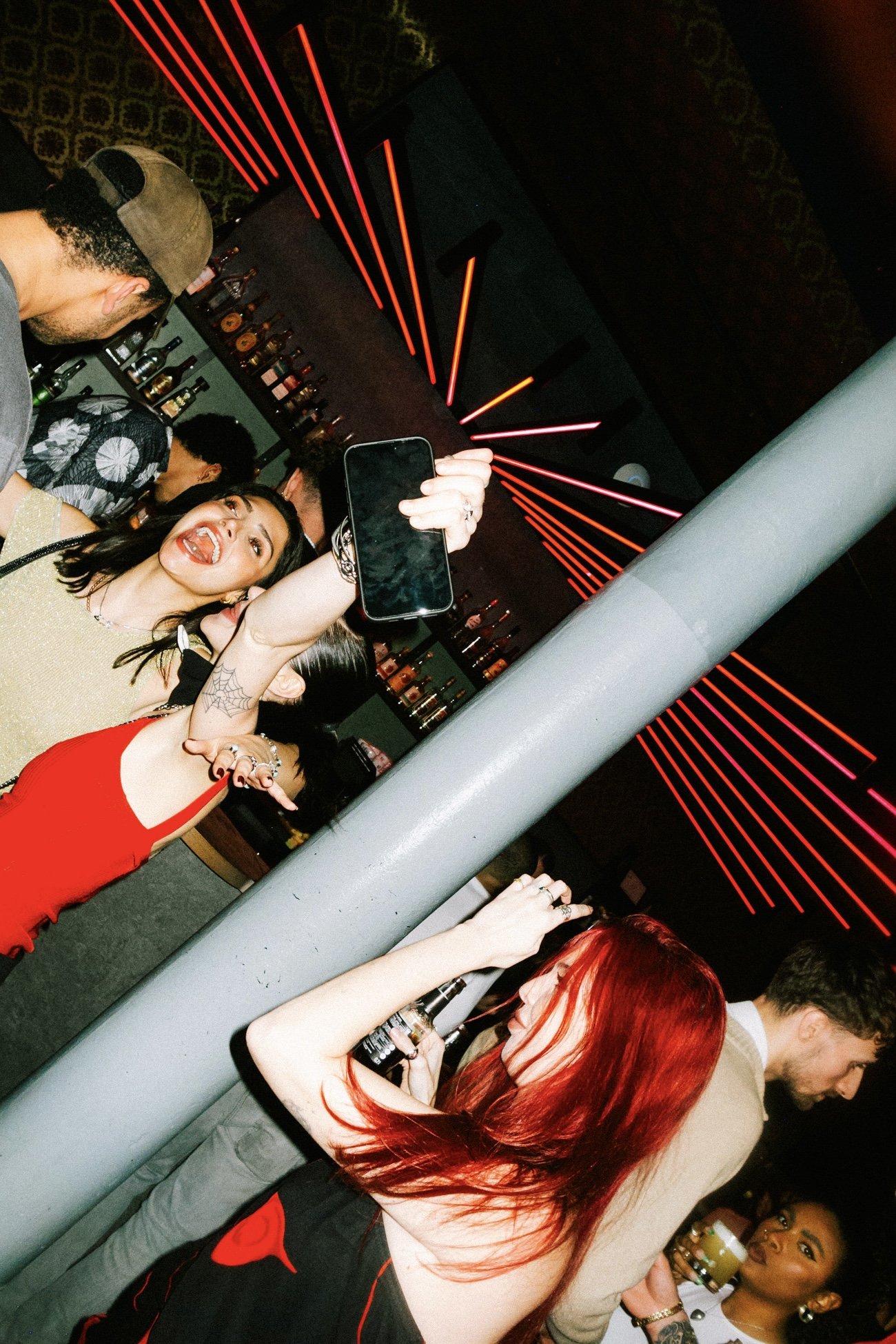
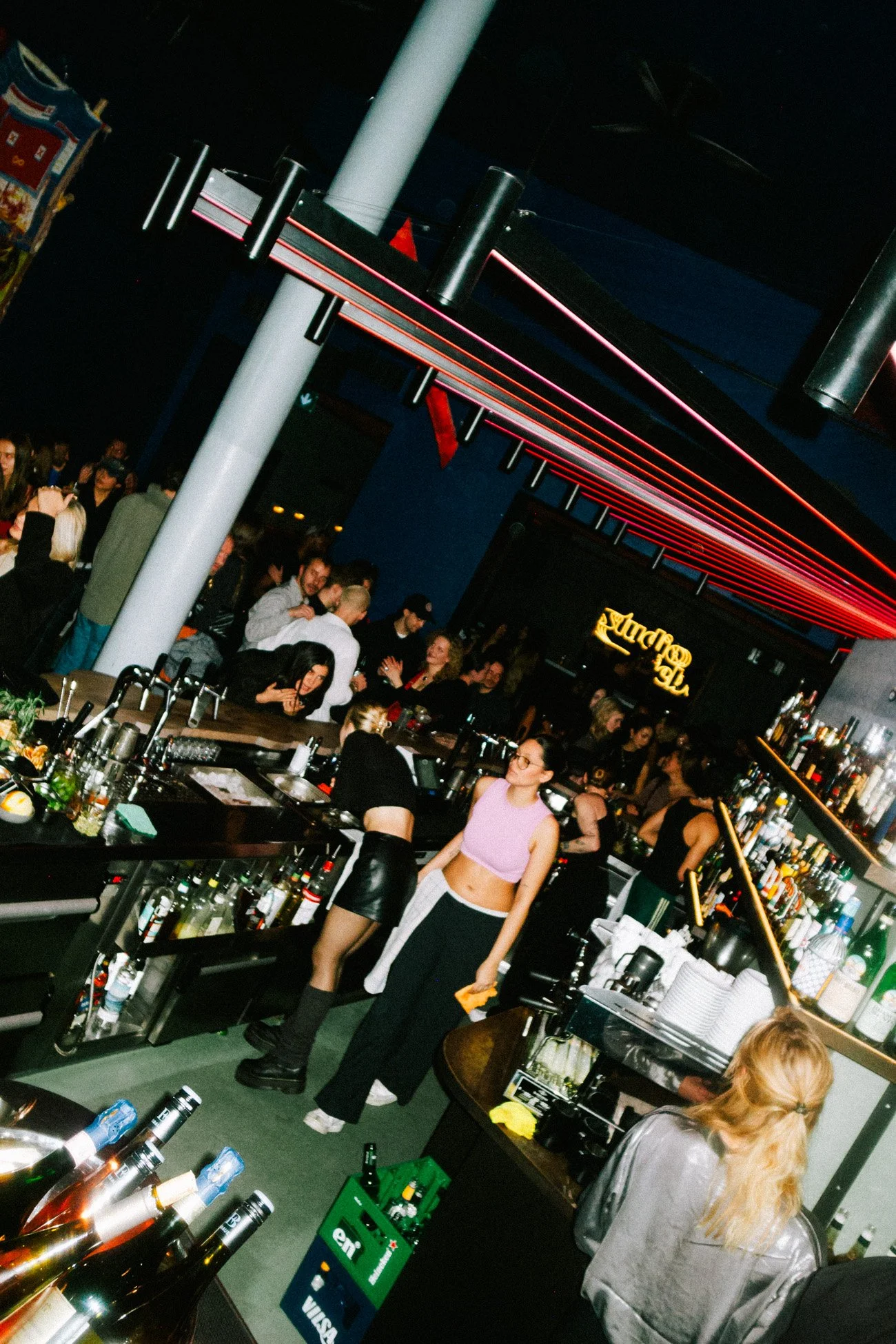
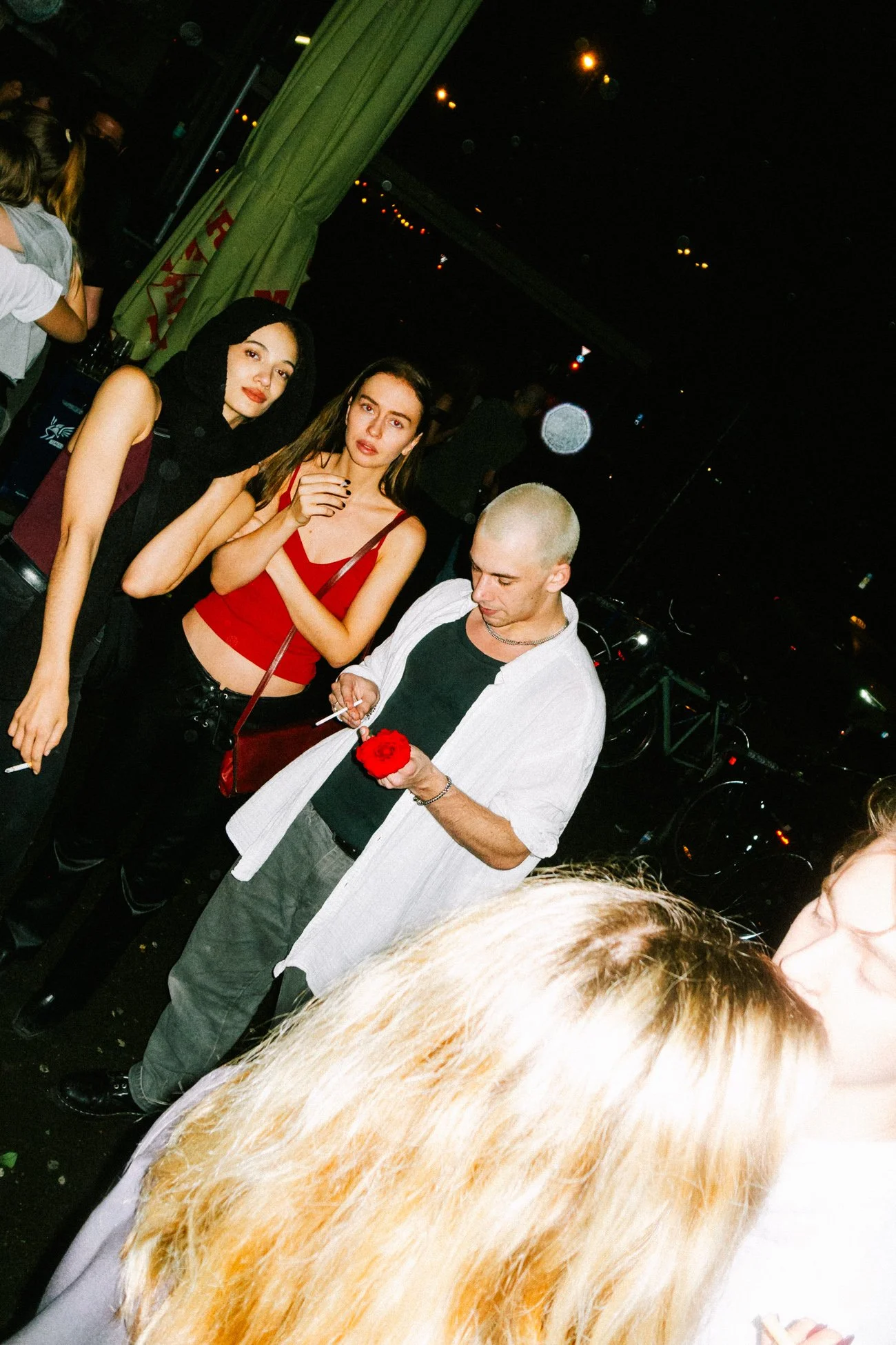
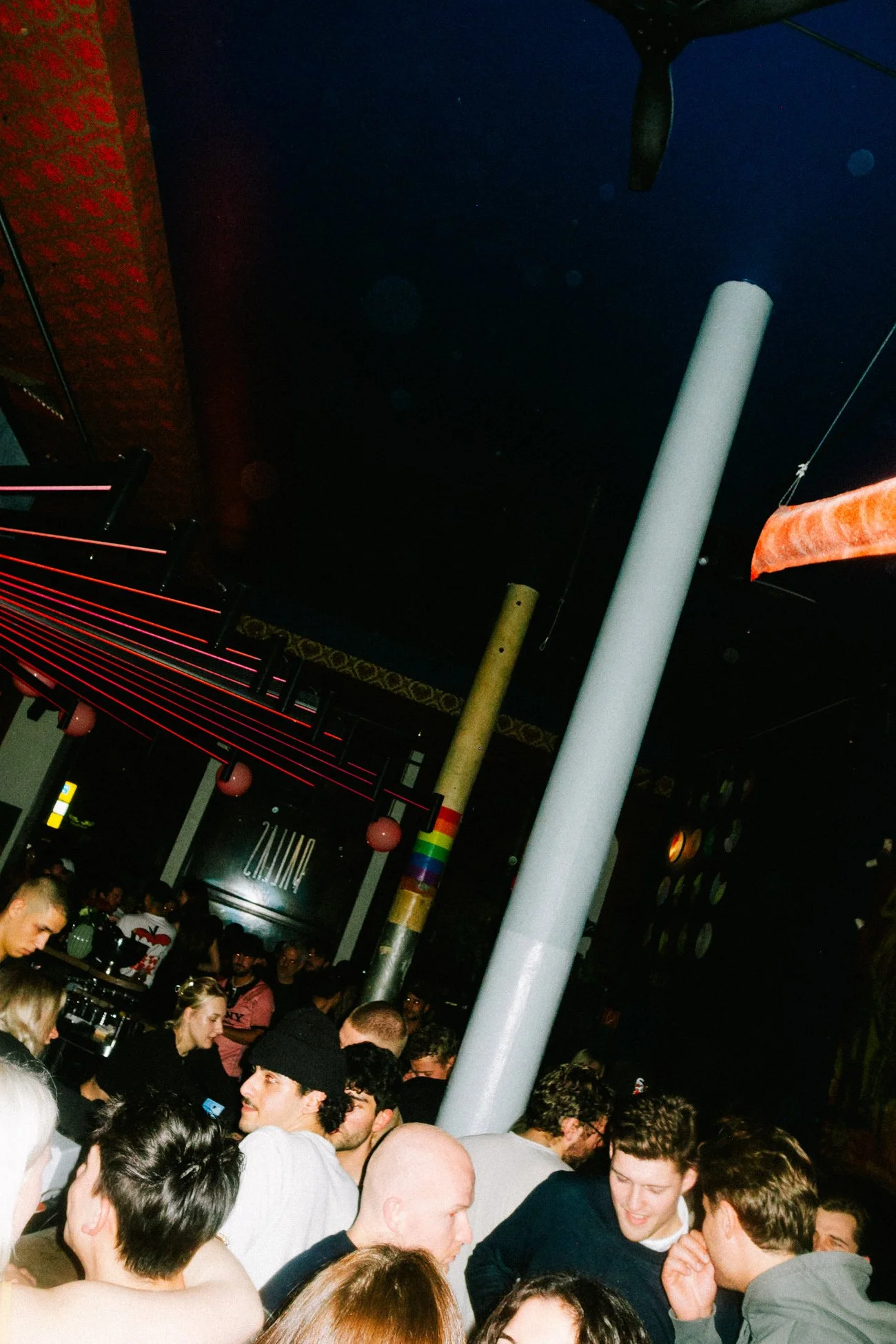
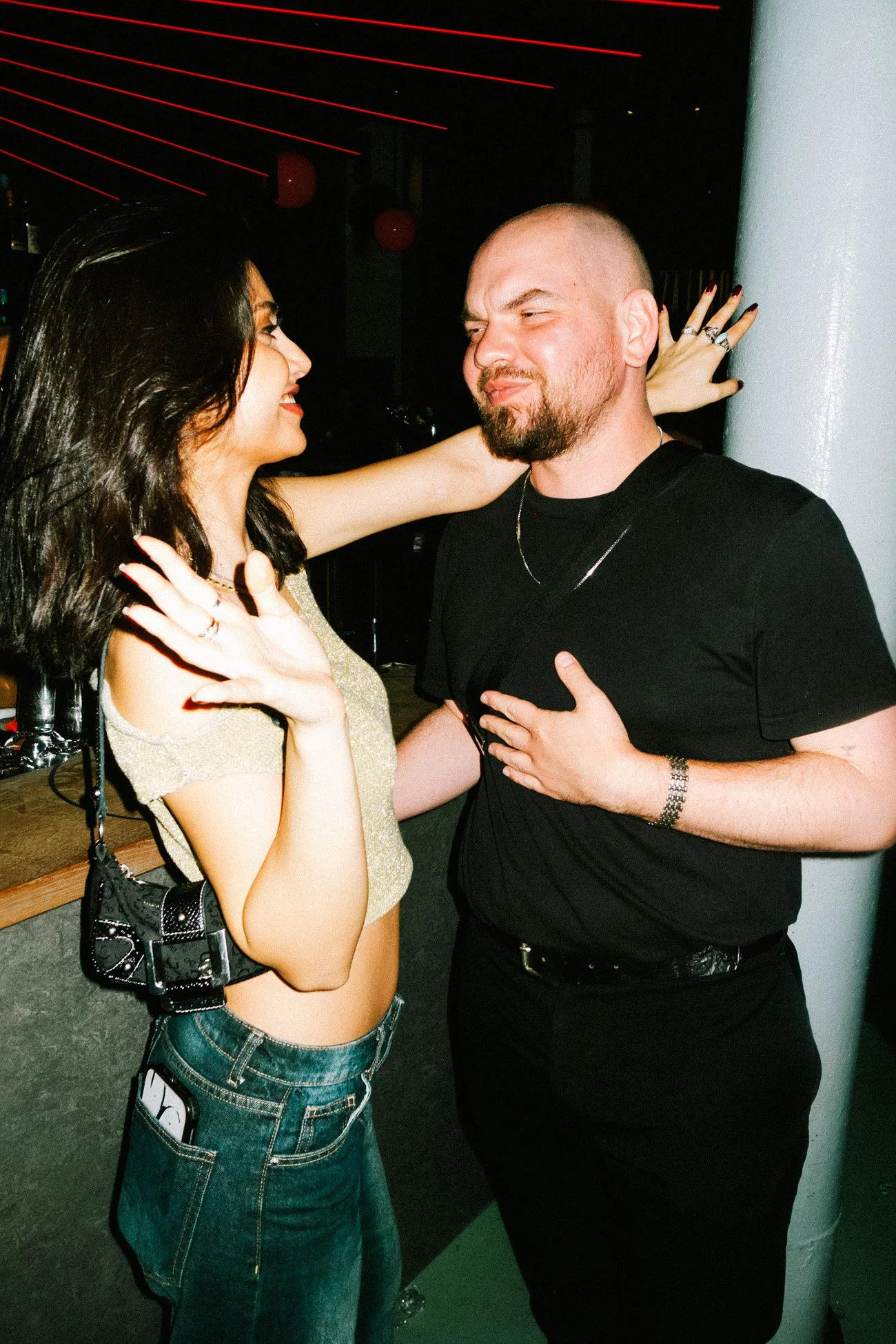
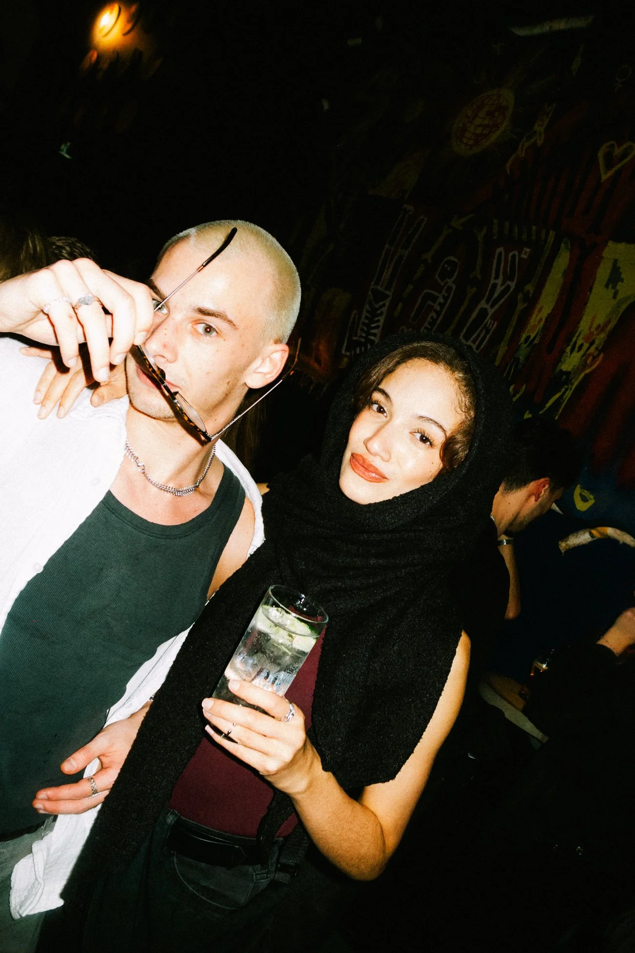
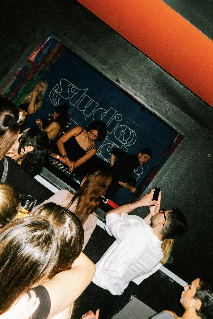
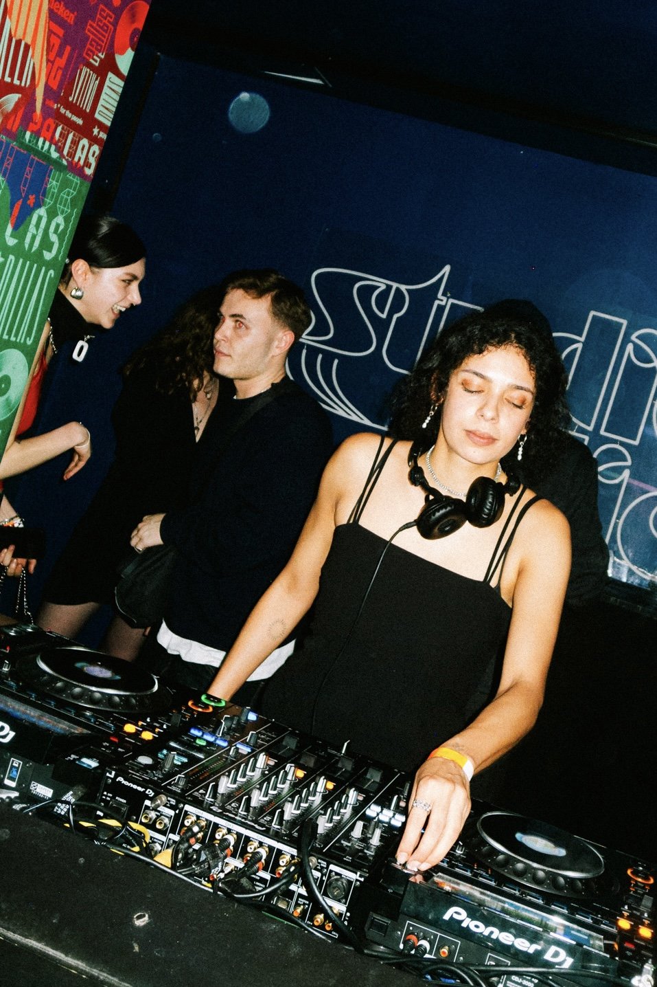
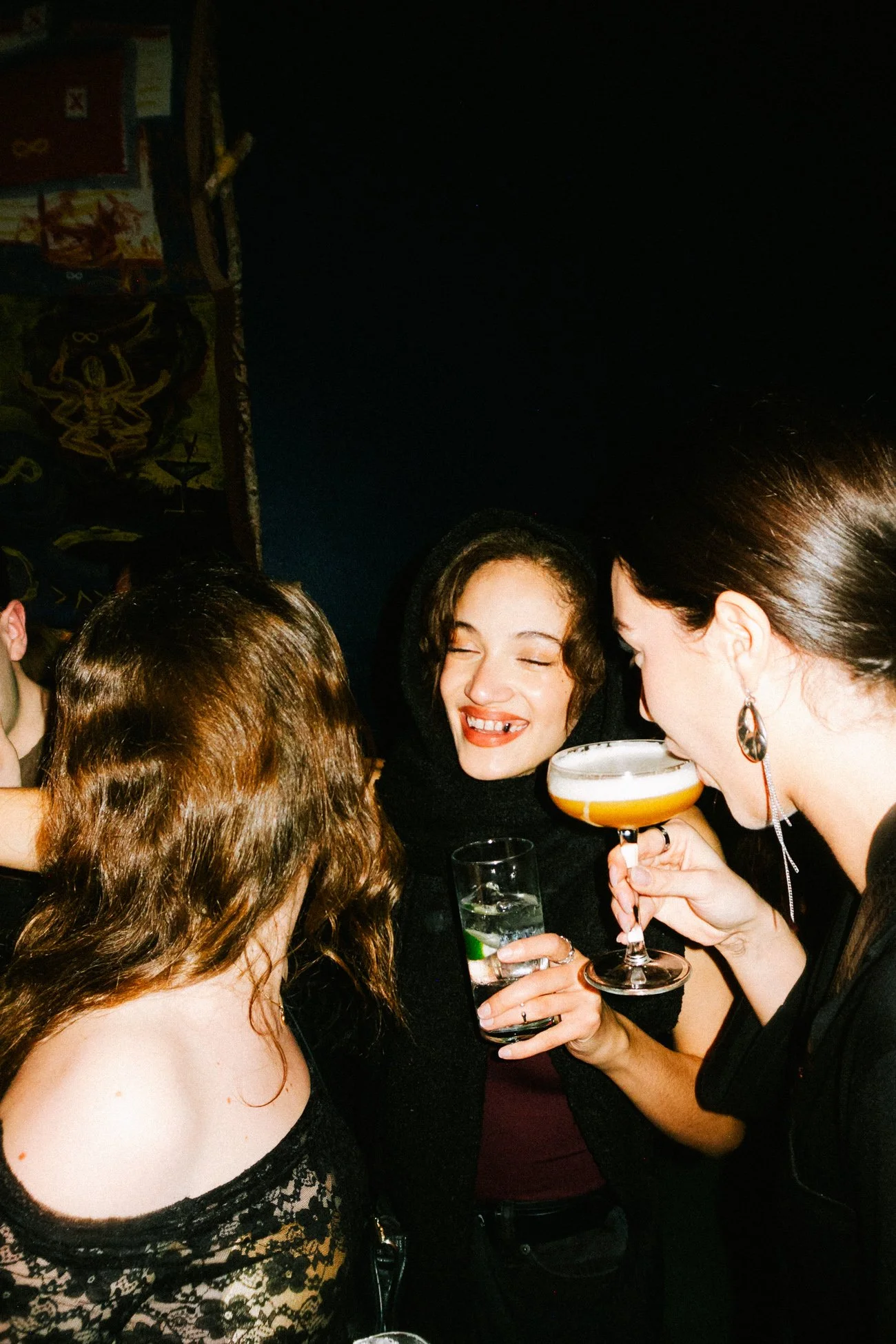
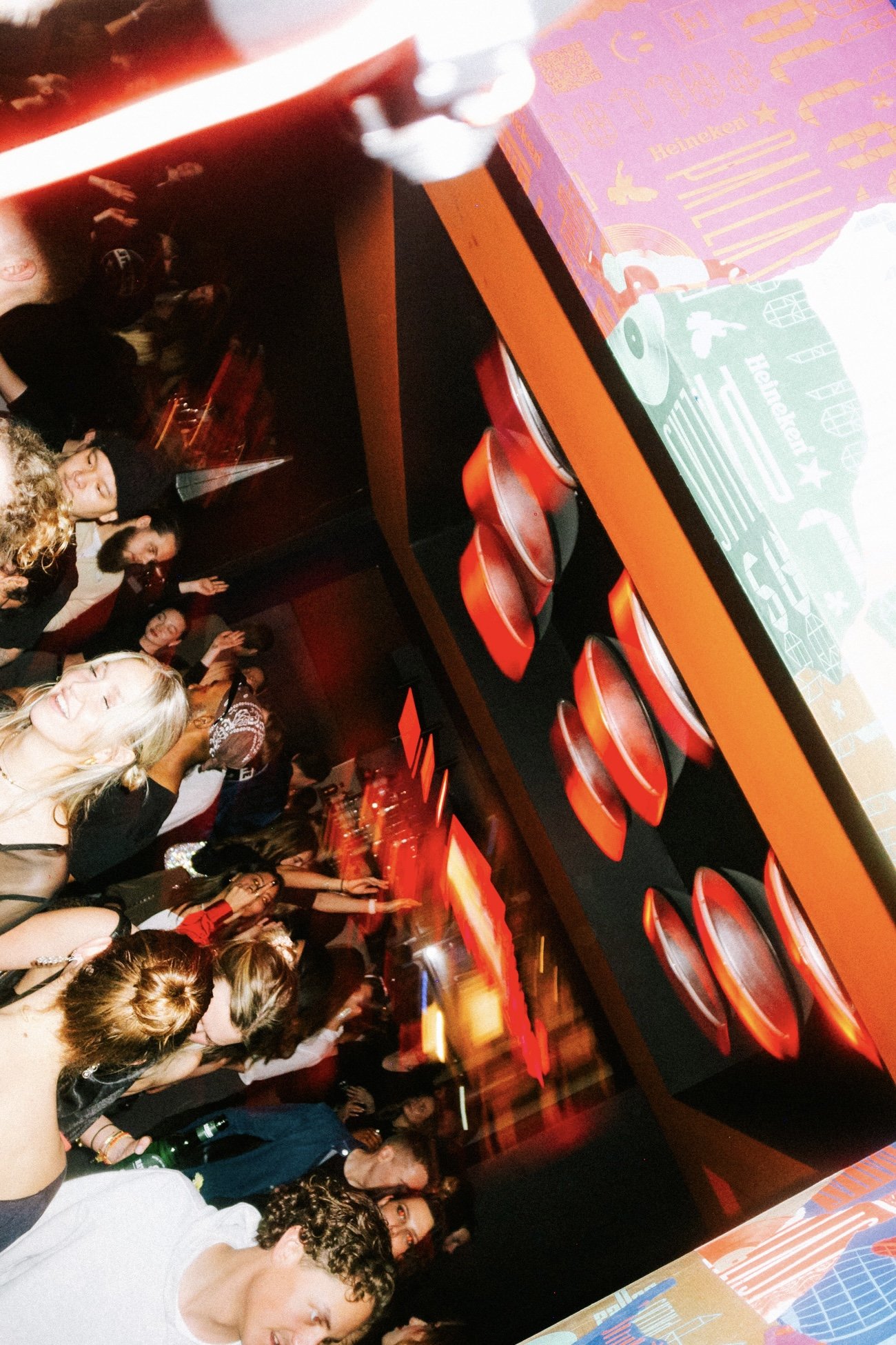
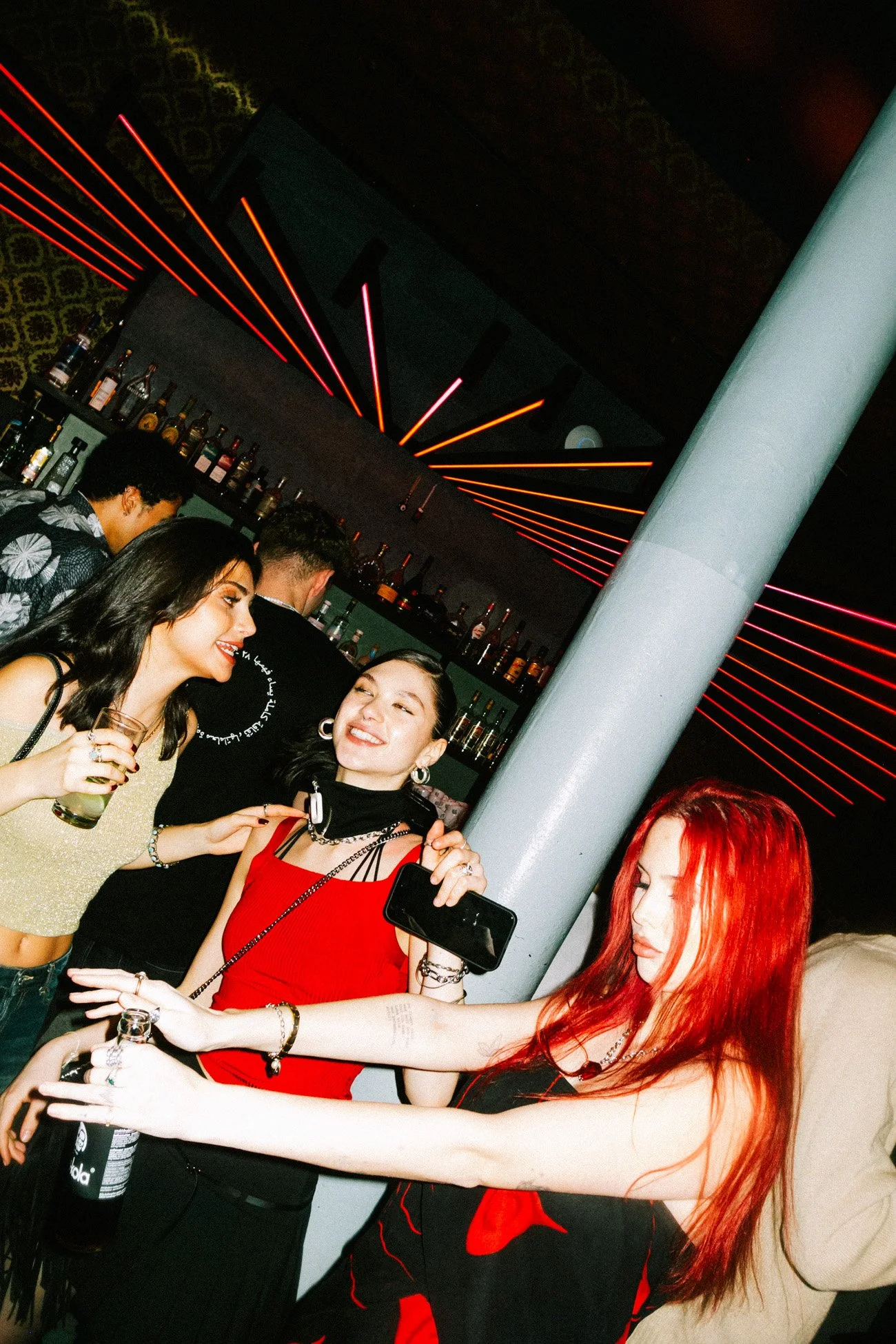

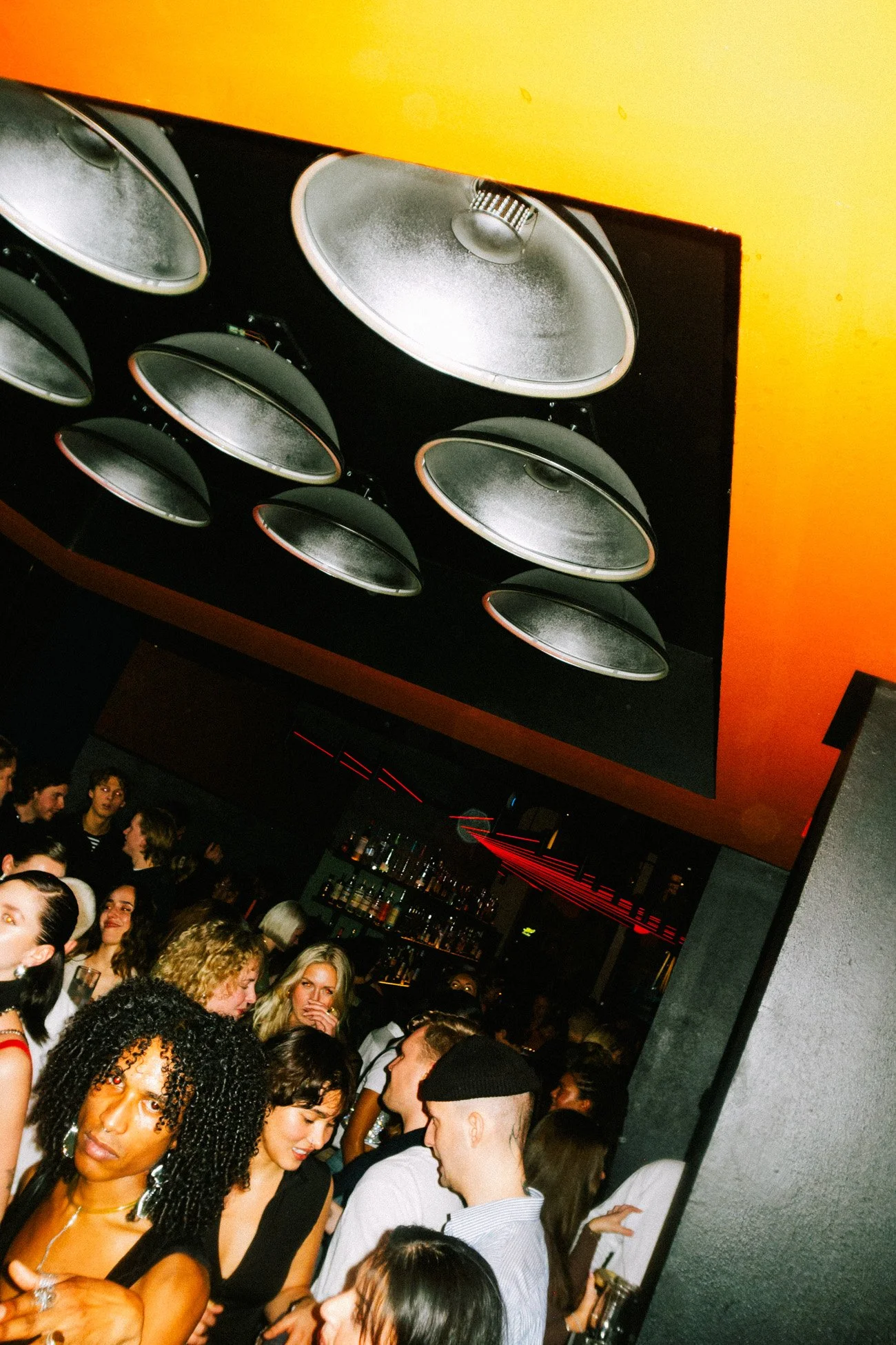
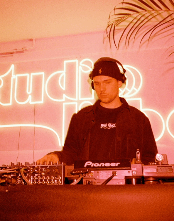
– shots taken at PALLAS.WORLD by Daniel Dittus
We had the honor of being the very first external party to host events at Pallas.World, a renowned bar and event space in Hamburg. Known for its eclectic and stylish interior and program, Pallas provided the perfect setting for the debut of Studio Liebe. The venue’s unique aesthetic—seamlessly blending sophistication with warmth—aligned beautifully with our vision of creating loving, immersive experiences.
A standout feature of Pallas is Bistro Bar 5, the restaurant located in the back. With its exquisite interior, partly provided by the Cramer family, esteemed purveyors of fine interiors in Hamburg, and delicious cuisine, guests had the opportunity to enjoy a memorable dinner before joining the event. With this combination of fine dining and nightlife we intended to add an extra layer of sophistication to the evening.
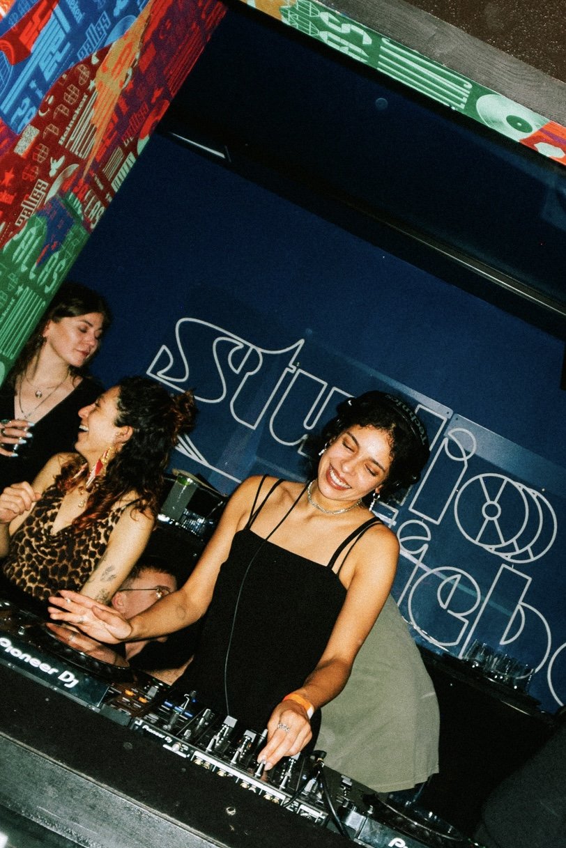
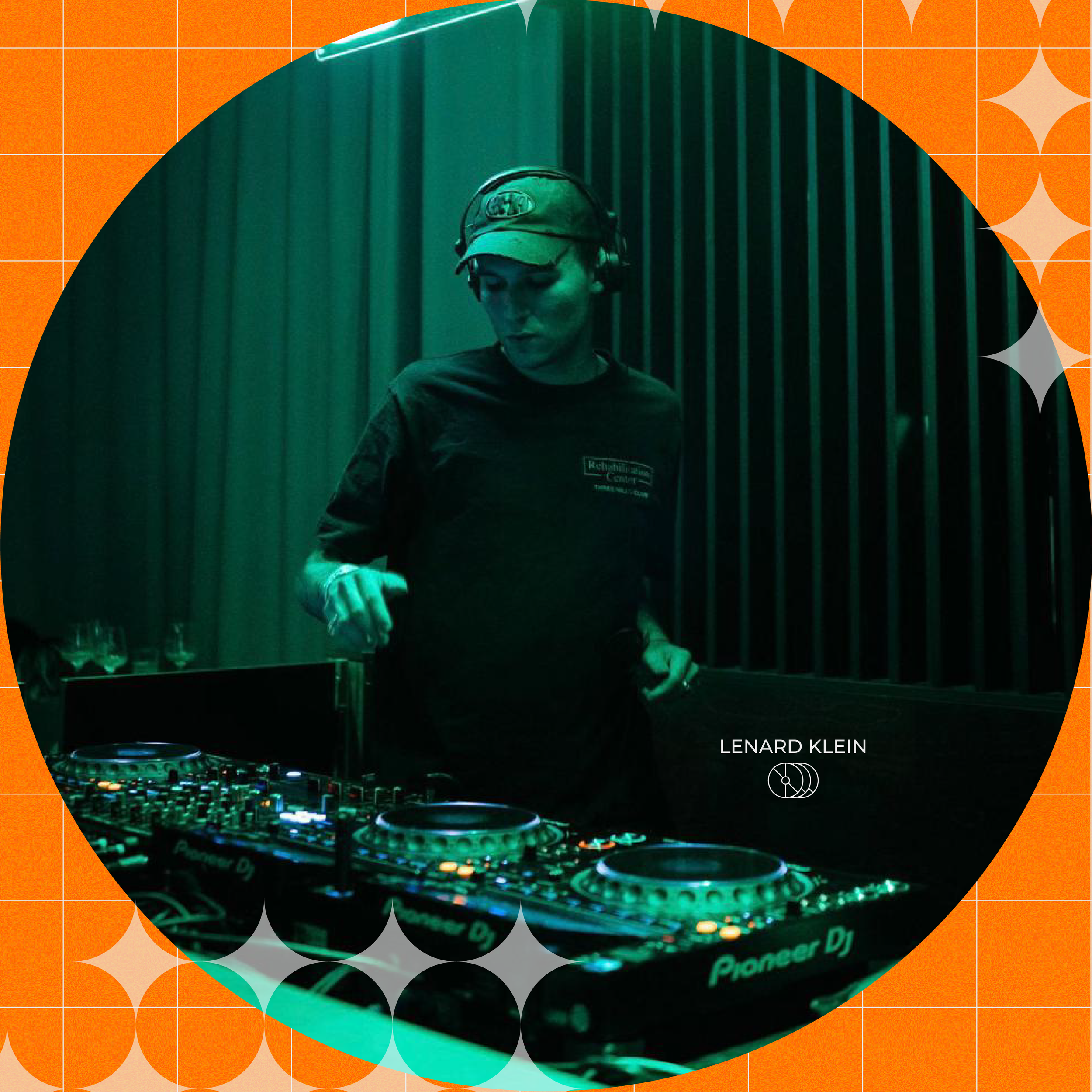
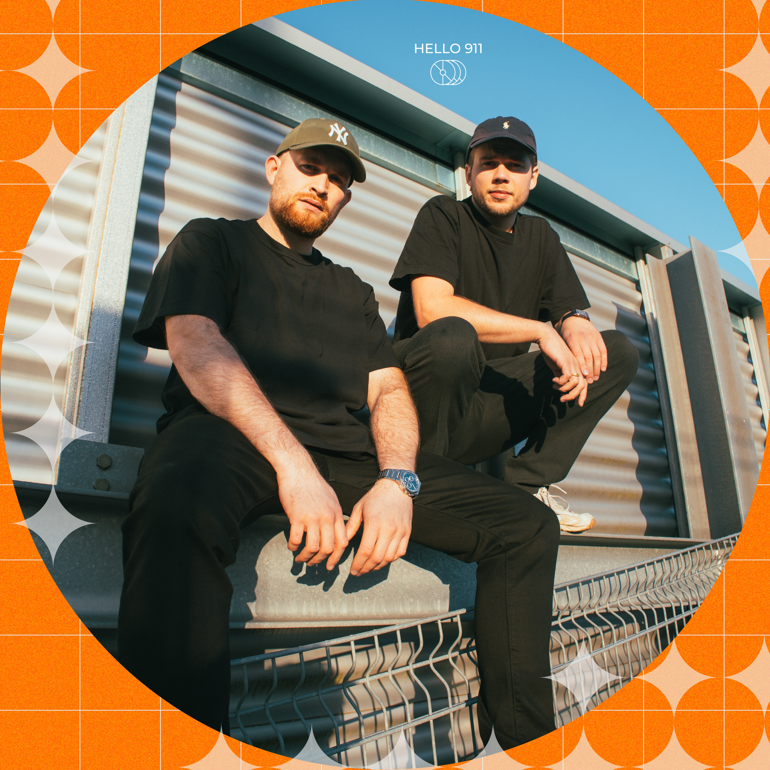
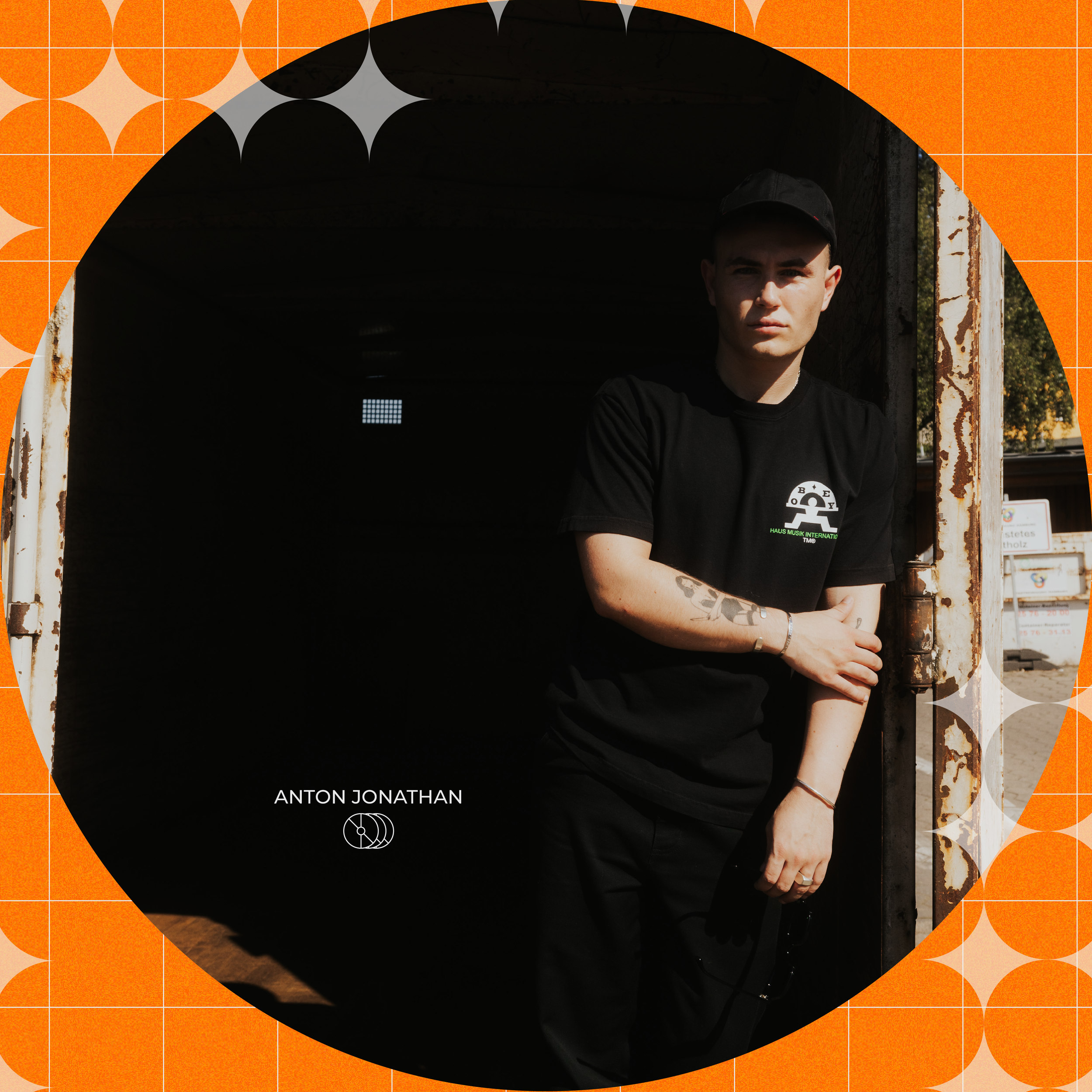
Inside the venue, our neon logo sign and custom smoke glass tabletop were displayed, creating striking visual focal points that tied together the event's design and branding. Complementing the atmosphere, we featured a lineup of well-known local house DJs, delivering an unforgettable soundtrack that perfectly encapsulated the essence of Studio Liebe.
The openness and cultural richness of Pallas.World mirrored our values, making it an ideal partner for our launch and setting the tone for what Studio Liebe is all about.
To promote the event, we incorporated the visual elements I designed specifically for our social media channels, including Instagram. Through our team’s diverse constellation and its strong network, our first reel reached 51.1K views within two days, helping to generate excitement and broaden awareness for Studio Liebe.


–Instagram carousel post
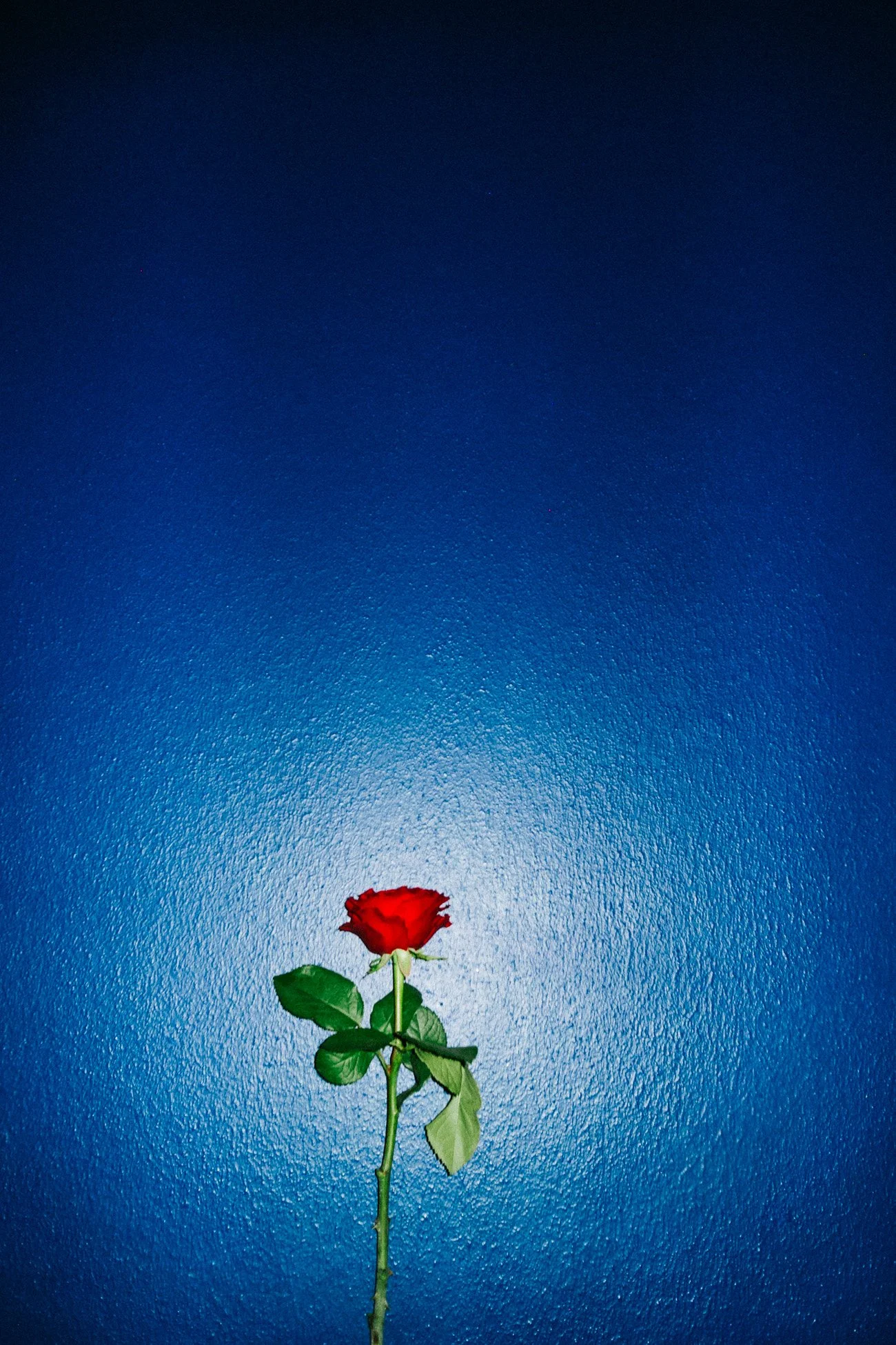
Valentine’s Day provided the perfect backdrop for a special Studio Liebe event at Pallas.World. The venue’s warm and inviting atmosphere, combined with our signature visual and musical elements, created a uniquely thematic celebration of love, connection, and good vibes — a night to remember for everyone who attended.
@ CRAMER WOHNVILLA HOSTED BY KUENSTLERBOERSE
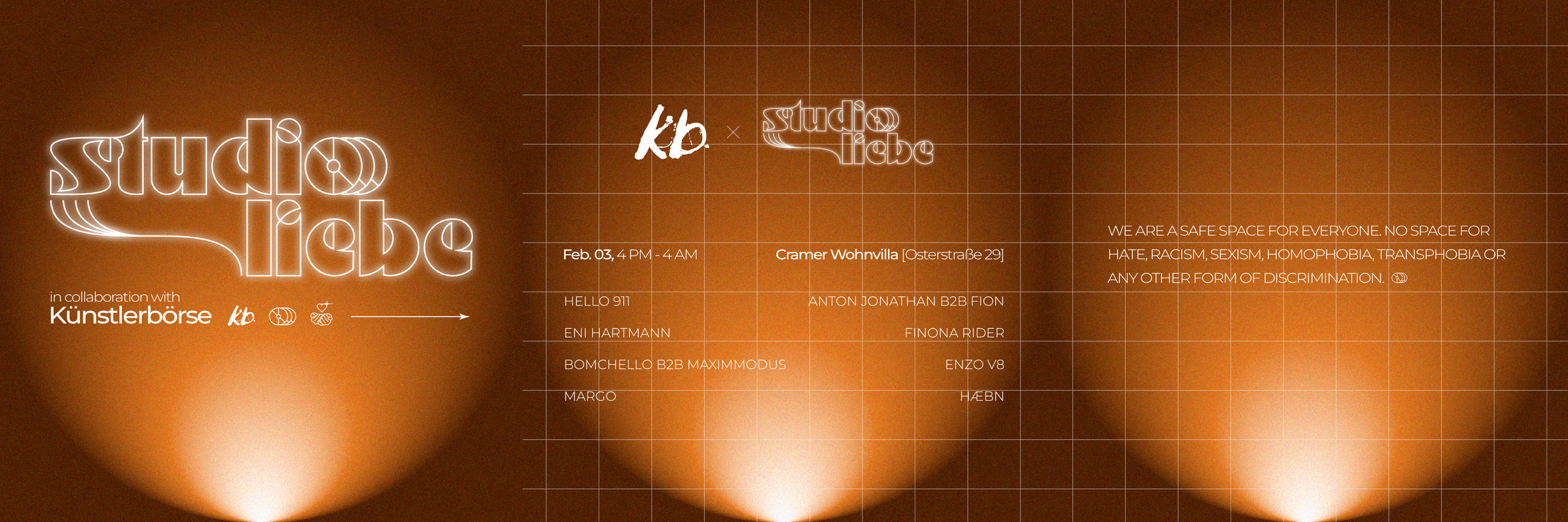
In February 2024, Studio Liebe had the privilege of supporting the revival of the Künstlerbörse, a renowned platform dedicated to showcasing emerging artists in Hamburg. The event took place at the Cramer Wohnvilla, a distinguished design furniture store and showroom in Hamburg's Eimsbüttel district, celebrated for its exquisite interiors and curated selection of international design pieces.
The vernissage featured the works of four talented young photographers, each presenting unique perspectives of Hamburg's vibrant art scene. Our collaboration involved curating a lineup of house music DJs from Studio Liebe, who provided a dynamic soundtrack throughout the night, seamlessly blending visual art with immersive soundscapes.
This event not only marked the resurgence of the Künstlerbörse, originally established in 1991 to offer emerging artists a platform for exposure and networking, but also underscored Cramer Wohnvilla's commitment to fostering cultural initiatives within the community. The harmonious integration of art, music, and design created an engaging atmosphere, attracting a diverse audience and contributing to the enrichment of Hamburg's cultural landscape.
Our participation in this vernissage exemplified Studio Liebe's dedication to supporting local art movements and collaborating with esteemed institutions like Cramer Wohnvilla and the Künstlerbörse. We look forward to future endeavors that continue to blend artistic expressions and create memorable experiences for the community.
–3D view of the venue